|
|
Post by Red Dragon on May 21, 2017 7:51:47 GMT
Diamond Geezer has picked up a copy of the new May pocket tube map, complete with a new illustration. He also mentions a new Night Tube Pocket Map edition (be warned... it has a stuffed gorilla as its artwork). There seems to not be many significant changes.
|
|
Chris M
Global Moderator
Forum Quizmaster
Always happy to receive quiz ideas and pictures by email or PM
Posts: 19,758
|
Post by Chris M on May 21, 2017 8:24:49 GMT
The day map on the TfL website has been updated to May 2017 but the night tube one hasn't. I haven't looked in detail at changes yet.
|
|
Chris M
Global Moderator
Forum Quizmaster
Always happy to receive quiz ideas and pictures by email or PM
Posts: 19,758
|
Post by Chris M on May 21, 2017 9:05:28 GMT
Differences between electronic March and May maps in no particular order:
Lancaster Gate has been un-struck through but the blue dagger remains.
Brentwood to Shenfield has now reopened.
Edgware and Highhams Park have lost their daggers relating to step-free access interruption.
Goodge Street has gained a red dagger meaning "Services or station access for these stations are subject to variation. Please search ‘TfL stations’ for full details."
Many labels have moved very slightly - it looks like there has been a change in the kerning setting that has caused this.
The zone labels for zones 3-6 on the east of the map have reverted to their December 2016 position - i.e. parallel to the District line rather than horizontal. The zone 4 label on the south of the map has also reverted to the December position, horizontally aligned between Morden and South Wimbledon rather than directly below the latter.
Between Canning Town and the river, the right edge of the shading for Zones 2 and 3 is now the Jubilee line, previously it extended a little right of that. It is now also slightly closer to the bottom of the label box for Canning Town station. This appears to be because the zone shading has reverted to the December 2016 position but Jubilee line moved right slightly in March when West Ham went from 3 to 2 blobs due to step-free access changes.
The Zone 3/4 boundary now runs through the blob for East Ham rather than slightly west of it (different to both March and December)
The "London trams fare zone" label in the bottom right has been moved right slightly so the L no longer starts on the gridline.
At Lloyd Park tram stop, the person in the wheelchair symbol now has a head - they didn't in either March or December, but did when the tram was first shown in June last year. They do have a head on the December pocket map (the only version I have to hand).
That's it, so virtually nothing of significance that I can see.
|
|
|
|
Post by Dstock7080 on May 21, 2017 10:11:21 GMT
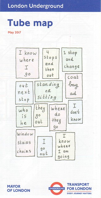 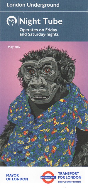 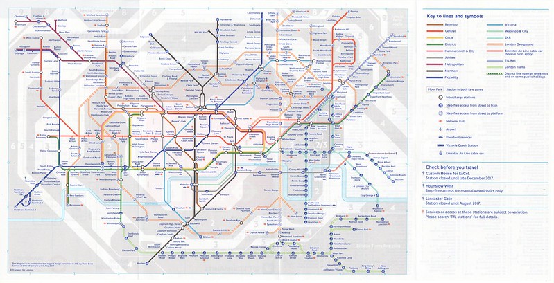 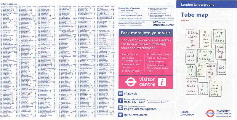 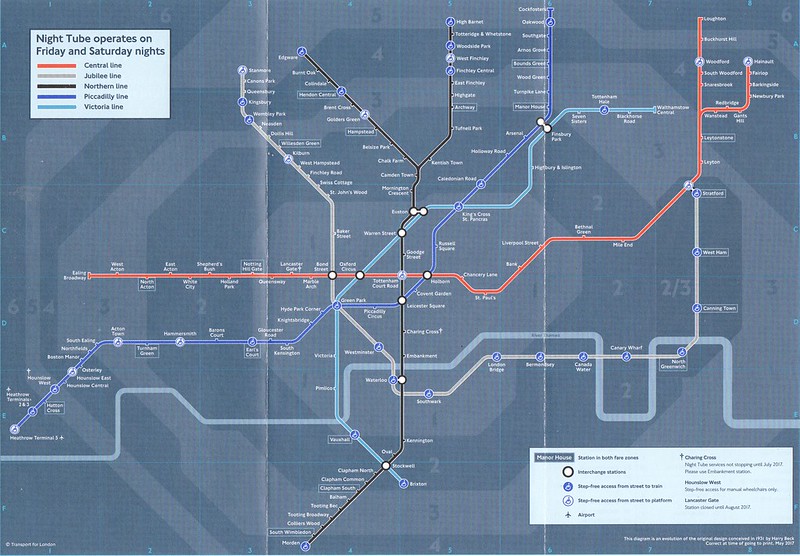 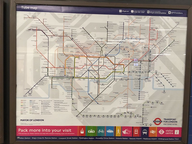 not wishing to tread on Chris M's toes, my own observations, Changes December 2016 to May 2017 card map: - new cover design; Out Next Stop by Lily van der Stokker 2017. - TfL Rail service, Brentwood-Shenfield; restored - London Overground, Barking-Gospel Oak; restored - Edgware; loses its dagger - Goodge Street; gains a dagger, no explanation - Highams Park; loses its dagger - Lambeth North; station no longer crossed through, loses its dagger - Lancaster Gate; station no longer crossed through, although retains its dagger, 'station closed until August 2017' - Barking; now step-free to train (was step-free to platform) - Blackfriars; now step-free to train (was step-free to platform) - Canonbury; now step-free to train (was step-free to platform) - Dagenham Heathway; now step-free to train (was step-free to platform) - Earl's Court (District) station; now step-free to train (was step-free to platform) - East Ham; now step-free to train (was step-free to platform) - Elm Park; now step-free to train (was step-free to platform) - Southfields; now step-free to train (was step-free to platform) - Tower Hill (District) station; now step-free to platform (was step-free to train) - Upminster; now step-free to train (was step-free to platform) - Wembley Park (Jubilee) station; now step-free to train (was step-free to platform) - West Ham (District/H&C) station; now step-free to train (was step-free to platform) - Woodside Park; now step-free to train (was step-free to platform) |
|
|
|
Post by jacks on May 21, 2017 12:15:42 GMT
Anyone know what the red dagger attached to Goodge Street refers to or is going to refer to? Of course searching TfL stations provides no help.
I note that Caledonian Road (for example) doesn't have a dagger so it makes me think it isn't something as simple as lift replacement.
|
|
|
|
Post by John Tuthill on May 21, 2017 13:34:18 GMT
Anyone know what the red dagger attached to Goodge Street refers to or is going to refer to? Of course searching TfL stations provides no help. I note that Caledonian Road (for example) doesn't have a dagger so it makes me think it isn't something as simple as lift replacement. Under the notes it says:"Services or access subject to variation." |
|
pitdiver
No longer gainfully employed
Posts: 439
|
Post by pitdiver on May 21, 2017 13:40:37 GMT
This might apply to the lift service as the station sometimes gets very busy if there are issues at Tottenham Court Road. In this case station control or whatever it's called these days will be bought in.
|
|
|
|
Post by jacks on May 21, 2017 14:40:19 GMT
Anyone know what the red dagger attached to Goodge Street refers to or is going to refer to? Of course searching TfL stations provides no help. I note that Caledonian Road (for example) doesn't have a dagger so it makes me think it isn't something as simple as lift replacement. Under the notes it says:"Services or access subject to variation." Yes but what is the variation?  The red dagger at West India Quay is due to the station not being served by Bank-Lewisham trains, the one at Camden due to it being exit only on Sunday afternoons, doesn't appear to be very consistent. |
|
|
|
Post by whistlekiller2000 on May 21, 2017 17:29:36 GMT
Under the notes it says:"Services or access subject to variation." Yes but what is the variation?  The red dagger at West India Quay is due to the station not being served by Bank-Lewisham trains, the one at Camden due to it being exit only on Sunday afternoons, doesn't appear to be very consistent. I suppose by saying "Services or access subject to variation." it is by definition not consistent!  Perhaps a call to the company will give you further information. |
|
|
|
Post by jacks on May 21, 2017 17:53:19 GMT
Haha, guess you're right there! Holborn is currently exit only during the morning peak and hasn't got a dagger to indicate that anything is going on there, now that could be seen as inconsistent
|
|
|
|
Post by rsdworker on May 21, 2017 17:56:45 GMT
i Note the Victoria station has no step free blob but its should show dagger that step free is available from northern ticket hall only to Victoria line only - i would suggest to them to add orange blobs to show that is part step free
|
|
Chris M
Global Moderator
Forum Quizmaster
Always happy to receive quiz ideas and pictures by email or PM
Posts: 19,758
|
Post by Chris M on May 21, 2017 22:46:07 GMT
i would suggest to them to add orange blobs to show that is part step free Please $deity no! There are many stations that are partially step free, e.g. Debden is step-free towards Epping only. There are many more where some interchanges are step free (e.g. same direction between Vic and Bakerloo at Oxford Circus), London Bridge is step free for access to both lines but step-free interchange is available only by walking between entrances at street level. And this is ignoring that just because something is or is not marketed as "step free" doesn't necessarily make it a reliable indicator of accessibility for a given person's needs. It is simply not possible to show a useful level of detail on the main map, which is why there are two separate publications, the "step free tube guide" and "avoiding steps tube guide" (names from memory, may not be verbatim) that go into more detail. These should be promoted more and the step-free blobs removed from the main map which is already trying to convey too much information. What would be ideal would be maps, available for download or by post (at cost) that you could customise with the layers that you wanted, e.g. Zones, train to platform gaps, access methods (e.g. lifts vs escalators vs fixed stairs), level access from street to train, access from street to train possible with no more than n steps in a flight, walking distance from street to train, etc.). The information is out there (the three existing maps and the Direct Enquiries website database is probably >99% of it), and the technology to make customisable maps is already there (see e.g. www.magic.gov.uk ). It would need some development work (possibly a collaboration between a cartographer and a developer) to get all the layer combinations working together on the tube map, but almost certainly less than was involved with redoing the journey planner a couple of years back. This would revolutionise the step-free information available and make the tube more accessible for many people for likely less than the cost of a single new lift. |
|
|
|
Post by rsdworker on May 21, 2017 23:26:18 GMT
well i know but i have seen new york map having show the partial step free and full step free
the partial step free shown as boxed text with icon but full step free - just icon
|
|
Deleted
Deleted Member
Posts: 0
|
Post by Deleted on May 28, 2017 22:05:48 GMT
For Victoria you could have it like Waterloo.
|
|
|
|
Post by trt on Jul 5, 2017 16:07:17 GMT
|
|
|
|
Post by brigham on Jul 5, 2017 16:13:35 GMT
This HAS to be a joke!
|
|
cso
Posts: 1,043 
|
Post by cso on Jul 5, 2017 16:32:31 GMT
|
|
DWS
every second count's
Posts: 2,487
|
Post by DWS on Jul 5, 2017 16:51:08 GMT
The map says tracks under tunnels, why not tracks in tunnels ?
|
|
|
|
Post by MoreToJack on Jul 5, 2017 17:04:23 GMT
It's very much real, and an excellent addition to the range of products maps. I'm not sure why anyone would think it to be a wind up.
Thank goodness none of you suffer from claustrophobia or anxiety to the point where travelling in a deep tube tunnel is seriously debilitating! These symptoms are very real and this map, for many, will be a literal life saver.
|
|
|
|
Post by trt on Jul 5, 2017 18:02:44 GMT
Well, I get panic attacks in crowds sometimes, and I suffer from migraines which can be brought on by loud noises. So do I get a map of places which are particularly crowded on the tube, or where there is considerable wheel screech?
|
|
rincew1nd
Administrator
Junior Under-wizzard of quiz
Posts: 10,286 
|
Post by rincew1nd on Jul 5, 2017 19:15:37 GMT
Well, I get panic attacks in crowds sometimes, and I suffer from migraines which can be brought on by loud noises. So do I get a map of places which are particularly crowded on the tube, or where there is considerable wheel screech? Suggest it to TfL, you may well do get something in the fullness of time. |
|
|
|
Post by Jerome H on Jul 5, 2017 20:00:12 GMT
The map makes sense in hind sight as there is so much above ground "underground" that there may be people who never use the tube and didn't realize how out In the open their journey is. That said, we all know the tube map is a distorted diagram and because of that the entire point of the map is rather useless, since you don't actually get any information on distances, or better, time in tunnels
|
|
|
|
Post by trt on Jul 5, 2017 20:32:24 GMT
Well, I get panic attacks in crowds sometimes, and I suffer from migraines which can be brought on by loud noises. So do I get a map of places which are particularly crowded on the tube, or where there is considerable wheel screech? Suggest it to TfL, you may well do get something in the fullness of time. Well they did collected metrics on station loading using the WiFi data, so crowdedness indices may become a feature of the live tube map very soon indeed, that's true. But I'd prefer some more strategically placed and maintained flange greasers than a map of noisy places! |
|
|
|
Post by crusty54 on Jul 6, 2017 19:33:10 GMT
It's very much real, and an excellent addition to the range of products maps. I'm not sure why anyone would think it to be a wind up. Thank goodness none of you suffer from claustrophobia or anxiety to the point where travelling in a deep tube tunnel is seriously debilitating! These symptoms are very real and this map, for many, will be a literal life saver. if you suffer from claustrophobia you just might not want to get on a tiny train |
|
|
|
Post by MoreToJack on Jul 6, 2017 20:30:59 GMT
Absolutely - but for others they'll be fine on a tube train (off peak) but only above ground with daylight out the window.
Claustrophobia (and anxiety, which is equally relevant) come in many different shapes and sizes. It really isn't clear cut and, as I said, I know that this map will be of great benefit to a great many people.
(And, of course, it's a useful graphical representation of that old pub quiz chestnut "how much of the Underground is actually underground?")
|
|
rincew1nd
Administrator
Junior Under-wizzard of quiz
Posts: 10,286 
|
Post by rincew1nd on Jul 6, 2017 23:28:53 GMT
Quite a few years ago I purchased a "Track Layout Diagram" poster from the LT Museum shop, it hangs on the wall in my lounge. I've shared some detail of locations on here before: 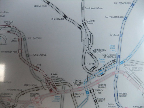
Tube Lines - Camden by Paul Knapton, on Flickr 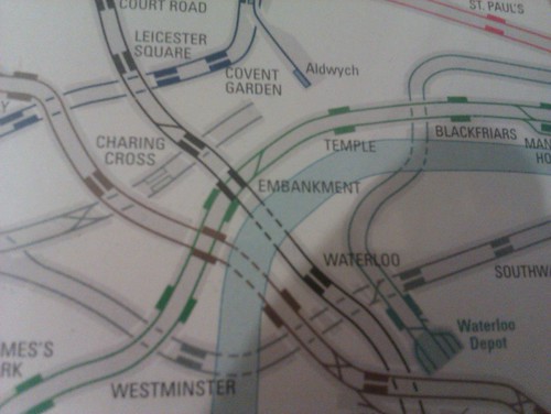
JLE Charing Cross to Waterloo by Paul Knapton, on Flickr It shows which section are tunnel and which not, it is effectively what T fL have just released: |
|
|
|
Post by Hutch on Jul 12, 2017 12:50:27 GMT
Talking of live tube maps are you familiar with this rather fancy product.
To watch them gently wobble to their destinations. Fascinating. |
|


