|
|
Post by kris on Jan 3, 2017 22:38:10 GMT
|
|
|
|
Post by kris on Jan 3, 2017 21:41:33 GMT
Yes - if you wish to exclude the 3 minor intermediate stations But that won't be Elizabeth line, just Railway .. correct? |
|
|
|
Post by kris on Jan 3, 2017 20:42:04 GMT
If Romford - Upminster is on the map, why not Greenford - West Ealing where it connects with a Crossrail station to Heathrow ?? I can't seem to find that on the future Elizabeth-lines maps. So it would be like this? upload.krisvandesande.be/files/030117/6099805.png |
|
|
|
Post by kris on Jan 3, 2017 19:44:26 GMT
Yes, like that exactly  Perfect! Thanks for that insight ... I love nitpicking like that, it adds details and a true deeper meaning to these stark lines on a map. |
|
|
|
Post by kris on Jan 3, 2017 19:24:44 GMT
Hmm .. my mind is mush at the moment, I can't seem to figure it out. 😳 Well click on this link the map is now centred on Rickmansworth. You might wanna zoom in a bit, but you see, next to Rickmansworth South Sidings is "Watford triangle", with "North Junction", "East Junction", "South Junction", "North Curve" and "South Curve" all marked on the diagram. So you can see what the North Curve is now, can't you? It allows a train to run directly from Rickmansworth to Croxley to Watford, right? Rather than going from Rickmansworth to Moor Park. And the same in the other direction, too, you can run from Watford to Croxley to Rickmansworth, instead of going from Watford to Croxley to Moor Park. Now some trains use this link in passenger service at the start of the day. For example, train 472D departs Chesham at 05.16, then serves Chalfont & Latimer, Chorleywood, Rickmansworth, Croxley and Watford, arriving at Watford 05.40½, you see? Also, the North Curve is sometimes used for passenger trains all day during engineering work that might be taking place on the line. However, very few trains use this route in normal passenger service, so it isn't actually shown on the tube map, or the diagrams inside cars. But you could show it on yours. If you wanted to. Right! That makes a lot more sense .. Soo .. like this ? upload.krisvandesande.be/files/030117/1442264.png |
|
|
|
Post by kris on Jan 3, 2017 19:00:09 GMT
You'll have to explain that one to me. I'm not an expert on that level of detail yet  A curve of track linking Rickmansworth with Croxley directly, allowing services such as Amersham - Watford - Northwood to be run (as was run during engineering works a few years ago). See: carto.metro.free.fr/cartes/metro-tram-london/Hmm .. my mind is mush at the moment, I can't seem to figure it out. 😳 |
|
|
|
Post by kris on Jan 3, 2017 18:49:12 GMT
Looks Good, one possible nit pick, but may be deliberate as the service is not worth much, Watford North Curve. You'll have to explain that one to me. I'm not an expert on that level of detail yet |
|
|
|
Post by kris on Jan 3, 2017 18:23:42 GMT
After some Reddit scrutiny, I fixed some more small issues, and I re-added the zones, but very, very subtle. Also I added back Heathrow Terminal 1, because nostalgia and make it more timeless. What do you fine people think? Any nitpick details I missed? upload.krisvandesande.be/files/030117/7421579.jpeg |
|
|
|
Post by kris on Jan 3, 2017 16:57:53 GMT
Hi, Does anyone know where the Seashell Moquette is of was being used? 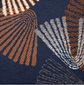 Thanks |
|
|
|
Post by kris on Dec 29, 2016 14:22:10 GMT
I feel that the current diagram has been all but ruined (in aesthetic terms) by the inclusion of zones, all the non LU lines, and the disabled access markers.Obviously the standard map should include these things, but it would be nice if LU also made available an 'Underground Only' version, with all but the actual LU lines (and the Thames) removed. It would not be a major undertaking, just involving the deletion of various sections of the PDF file (or the file that generates it). Well, for my new office I was looking for a nice LU design map to print. As you I was quite frustrated by all the extra information that takes away from the design. Since I know my way around Illustrator quite well, I imported the TFL PDF's into the software, and I started cleaning up. I got rid of the Overground lines, London Rail and the London Trams. I kept in the DLR because I liked how it filled things up on the side, though I made the colour solid. Of course, when I was almost done, I remembered that the Elisabeth would also be underground, and since it would be a big addition to the tube, I added that as well to the map. Because I want it to feel like a more timeless design, the background is beige, with the map lines a darker tone. My most "controversial" addition is that I coloured the labels with the colours of the line. So, this is how the map looks today. upload.krisvandesande.be/files/281216/1080857.jpegI'd love feedback ! <<superteacher: thread split>> |
|