|
|
Post by roboverground on Mar 31, 2013 11:23:24 GMT
|
|
pitdiver
No longer gainfully employed
Posts: 439
|
Post by pitdiver on Mar 31, 2013 11:30:13 GMT
If I sound a bit of a Philistine so be it. But I think 20 227 looks splendid in LUL livery.
|
|
|
|
Post by phillw48 on Mar 31, 2013 12:24:35 GMT
I'm waiting for Bachmann to make a R-T-R model of it.  |
|
Deleted
Deleted Member
Posts: 0
|
Post by Deleted on Mar 31, 2013 12:26:10 GMT
Looking good!
|
|
|
|
Post by crusty54 on Mar 31, 2013 13:58:46 GMT
non corporate roundel
|
|
metman
Global Moderator
5056 05/12/1961-23/04/2012 RIP
Posts: 7,400
|
Post by metman on Mar 31, 2013 14:14:11 GMT
I think it looks shocking!
|
|
rincew1nd
Administrator
Junior Under-wizzard of quiz
Posts: 10,236  Member is Online
|
Post by rincew1nd on Mar 31, 2013 17:21:20 GMT
I don't know, it just looks wrong somehow. Perhaps a bit too "Stagecoach"?
|
|
mrfs42
71E25683904T 172E6538094T
Big Hair Day
Posts: 5,922
|
Post by mrfs42 on Mar 31, 2013 17:22:40 GMT
It does have more than a whiff of tonka toy about it, though....
|
|
Chris M
Global Moderator
Forum Quizmaster
Always happy to receive quiz ideas and pictures by email or PM
Posts: 19,425
|
Post by Chris M on Mar 31, 2013 18:41:11 GMT
I don't know, it just looks wrong somehow. Perhaps a bit too "Stagecoach"? I think it's the yellow that's partly responsible for that, and the blue looks perhaps a shade too light? Overall I actually quite like it. |
|
metman
Global Moderator
5056 05/12/1961-23/04/2012 RIP
Posts: 7,400
|
Post by metman on Mar 31, 2013 19:05:07 GMT
I don't know, it just looks wrong somehow. Perhaps a bit too "Stagecoach"? Yes, think you've got a point there! |
|
cso
Posts: 1,043
|
Post by cso on Mar 31, 2013 23:25:44 GMT
I think it looks hideous, as did HWMBO...
|
|
|
|
Post by astock5000 on Apr 1, 2013 1:47:43 GMT
It has more red on it than I expected, but I think I like it.
|
|
pitdiver
No longer gainfully employed
Posts: 439
|
Post by pitdiver on Apr 1, 2013 7:56:31 GMT
Now it's got a new lick of paint what about giving it a name. How about Charles Pearson?
|
|
rincew1nd
Administrator
Junior Under-wizzard of quiz
Posts: 10,236
Member is Online
|
Post by rincew1nd on Apr 1, 2013 9:09:04 GMT
It has more red on it than I expected, but I think I like it. I think you've hit the nail on the head, the red should just curl around the nose then stop rather than three feet down the sides. |
|
Deleted
Deleted Member
Posts: 0
|
Post by Deleted on Apr 1, 2013 9:10:13 GMT
How about Boris The Chopper!
XF
|
|
pitdiver
No longer gainfully employed
Posts: 439
|
Post by pitdiver on Apr 1, 2013 10:12:06 GMT
On looking at it again I think it looks like something out of "Thomas The Tank Engine". But I still like it.
|
|
Deleted
Deleted Member
Posts: 0
|
Post by Deleted on Apr 1, 2013 12:31:42 GMT
Kinda looks like they forgot to install New Johnston when they made the roundel (Sticker? I don't know?).
|
|
|
|
Post by phillw48 on Apr 1, 2013 13:45:13 GMT
How about Boris The Chopper! XF I thought that was one of his nicknames?  Boris for the chopper sounds better!  |
|
|
|
Post by metrailway on Apr 1, 2013 15:26:17 GMT
IMHO, it just doesn't look right. The non-corporate logo is a bit annoying. The red at the non cab end goes down the sides of the loco for some distance which makes the livery not flow naturally with the loco. I would prefer something like this (it is quick drawing!): 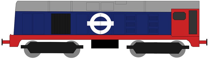 Class 20 Class 20 by metrailway, on Flickr or if one must keep the white: 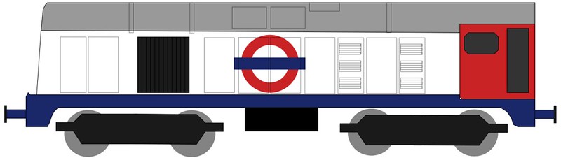 class 20 fantasy livery 2 class 20 fantasy livery 2 by metrailway, on Flickr |
|
|
|
Post by norbitonflyer on Apr 1, 2013 16:09:11 GMT
Is the large area of red at the non-cab end supposed to be symmetrical with the red cab at the other end? I would be interested to see a full-length side on view
|
|
Deleted
Deleted Member
Posts: 0
|
Post by Deleted on Apr 1, 2013 19:26:08 GMT
i dont mind the look, but perhaps a bit less of the red.
|
|
|
|
Post by carltona on Apr 2, 2013 18:33:22 GMT
How about calling it Ron Harris?
|
|
Deleted
Deleted Member
Posts: 0
|
Post by Deleted on Apr 3, 2013 6:37:43 GMT
I hired it for a photo shoot last week to raise a bit of cash for the owning group. Having been close up and personal with it, I think it looks very good. My one criticism would be the half yellow panels which don't look quite right. They wanted as much red as possible to match the LUL colours, but as it is a Network Rail passed loco it has to have yellow on the ends. I think it would look better with full yellow ends. The logo on the side is hand painted just as a point of interest.
|
|
|
|
Post by phillw48 on Apr 3, 2013 8:08:14 GMT
If there is anything that jars from my point of view it is the blue buffer beams. It would be far better I think if they were painted red or maybe yellow.
|
|
Deleted
Deleted Member
Posts: 0
|
Post by Deleted on Apr 4, 2013 6:21:59 GMT
|
|
rincew1nd
Administrator
Junior Under-wizzard of quiz
Posts: 10,236
Member is Online
|
Post by rincew1nd on Apr 4, 2013 6:34:28 GMT
Its definitely more pleasing from the cab end.
|
|


 Boris for the chopper sounds better!