Deleted
Deleted Member
Posts: 0
|
Post by Deleted on May 15, 2007 17:01:48 GMT
First post so please be gentle with me if this is discussed elsewhere or is in the wrong place.
I have read elsewhere that there are four solid roundels still on platforms on the network:
Ealing Broadway
Covent Garden (westbound I believe)
Possibly Caledonian Road (is it still there?)
anyone tell me where the fourth is, if it is anywhere?
Thanks
|
|
Deleted
Deleted Member
Posts: 0
|
Post by Deleted on May 15, 2007 17:40:21 GMT
Manor House I think.
|
|
Deleted
Deleted Member
Posts: 0
|
Post by Deleted on May 15, 2007 19:38:16 GMT
Cally Road is indeed still there, west end of westbound...
|
|
Deleted
Deleted Member
Posts: 0
|
Post by Deleted on May 16, 2007 8:35:14 GMT
Thanks for the infor.
I have this unhealthy thing for taking photos of station roudels so will take the three ones I haven't got over the next few weeks.
|
|
|
|
Post by version3point1 on May 16, 2007 11:53:32 GMT
I have this unhealthy thing for taking photos of station roudels so will take the three ones I haven't got over the next few weeks. Nothing wrong with that. Best take pictures of them now before some so and so decides to rip them out because it doesn't comply with TfL's current 'Corporate Identity' colour scheme...  |
|
Deleted
Deleted Member
Posts: 0
|
Post by Deleted on May 16, 2007 17:38:49 GMT
I have the bank holiday weekend written in to collect a few more roundels to add to the collection so I will do the Piccadilly ones then. Sorry for the blatant plug but: inspectorsands.fotopic.net/c1046911.html is the current collection, but it does the raise question is there such a thing as a current corporate identity colour scheme as all the slight differences are there. |
|
|
|
Post by mandgc on May 16, 2007 23:17:19 GMT
Manor House- Solid Roundel.
I thought the solid (disc) roundel had been replaced by the open circle when M House was opened in 1932.
|
|
|
|
Post by abe on May 17, 2007 7:29:18 GMT
Slightly OT, but since you're collecting roundel pictures there's an unusual survivor at St James's Park, at (I think) the Broadway end. Unlike all of the other roundels it reads "St James' Park". This dropping of the possessive 's' was fashionable at one point...
|
|
|
|
Post by loughtonsiding on May 17, 2007 14:18:57 GMT
Do the roundels with a non-standard, serifed, font at Sudbury Town still exist?
|
|
Deleted
Deleted Member
Posts: 0
|
Post by Deleted on May 17, 2007 16:28:17 GMT
I think they do...
|
|
Deleted
Deleted Member
Posts: 0
|
Post by Deleted on May 17, 2007 17:42:06 GMT
Well I am going to try and get all the stations that I am missing, with the exception of Regents Park, over the next couple of weeks so I will investigate all of those. Watch this space!
|
|
Deleted
Deleted Member
Posts: 0
|
Post by Deleted on May 26, 2007 20:12:55 GMT
Sorry for the slight bump but I was out and about today and saw the St James' Park roundel and the different font at Sudbury Town still existing. Piccies on the website if fotopic behaves itself.
|
|
Deleted
Deleted Member
Posts: 0
|
Post by Deleted on May 26, 2007 20:25:51 GMT
And not just the roundels... notice too, that the Yerkes Tube stations with names fired on to the tiles, are subtly different...
|
|
Deleted
Deleted Member
Posts: 0
|
Post by Deleted on May 28, 2007 5:51:09 GMT
Don't forget the unusual roundel at West Brompton e/b with inter connecting v's.
|
|
Deleted
Deleted Member
Posts: 0
|
Post by Deleted on May 28, 2007 7:08:45 GMT
And there are still roundels at Burnt Oak and South Wimbledon with the old suffixes. BTW I didn't find the fourth solid roundel.
|
|
|
|
Post by abe on May 29, 2007 7:34:04 GMT
Do the roundels with a non-standard, serifed, font at Sudbury Town still exist? The font is known as Delf-Smith, after the designer. I don't think that it was used anywhere else on the Underground. |
|
|
|
Post by loughtonsiding on May 29, 2007 11:38:01 GMT
That's interesting. It appears that there is a Johnson Delf-Smith font, "developed for use on some historical signs". tinyurl.com/2frgkzWikipedia (which obviously needs to be taken with the usual caution) says that it was developed by TfL, "based on a font developed in the 1920s by Percy Delf Smith for London Underground as a serif variation of the organisation's standard sans-serif Johnston font". tinyurl.com/25za4rThe Wikipedia entry for teh Jonson typeface says that: "Frank Pick later commissioned Percy Delf Smith (another former pupil) to draw up a 'petit-serif' adaptation of the typeface, originally for the headquarters building at 55 Broadway, SW1. It can still be seen on some signs at Sudbury Town and Arnos Grove on the Piccadilly line. In early 2007, an electronic version of the typeface was developed, Johnston Delf Smith, specifically for use on historic signs". tinyurl.com/ypmd6vSo, if the Wikipedia entries are correct, it seems that the font was more widely used, and that there are old and new versions. I haven't seen either version in lower case, but I'd guess that the newer version will be based on the New Johnson, and incorporate teh changes between that and the original Johnson. |
|
Deleted
Deleted Member
Posts: 0
|
Post by Deleted on May 30, 2007 20:40:48 GMT
Incidentally, there's a single roundel sign at Edgware on platforms 2/3, with an unusual font(unusual for LU, that is). It caught my attention because the 'W' is comprised of two overlapping Vs. Does anyone know the reason for this typeface?
|
|
Deleted
Deleted Member
Posts: 0
|
Post by Deleted on May 30, 2007 20:49:37 GMT
I think it was perhaps a typeface used by a contractor, rather like this non-standard sign at Aldgate: 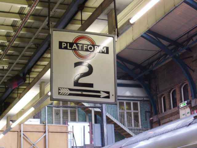 David |
|
Deleted
Deleted Member
Posts: 0
|
Post by Deleted on May 30, 2007 21:03:06 GMT
The numerals looks distinctively New York Subway-esque from around the early 70's, as their typeface looks very similar...
|
|
Deleted
Deleted Member
Posts: 0
|
Post by Deleted on May 30, 2007 22:45:41 GMT
Incidentally, there's a single roundel sign at Edgware on platforms 2/3, with an unusual font(unusual for LU, that is). It caught my attention because the 'W' is comprised of two overlapping Vs. Does anyone know the reason for this typeface? I've found a picture of the offender... |
|
|
|
Post by mandgc on May 30, 2007 23:14:40 GMT
The interlinked 'W' , used in the earlier roundel signs, was superceded later by the present 'double V'. It still appeared at a number of stations after the 1939/45 War.
|
|
|
|
Post by abe on May 31, 2007 15:38:28 GMT
The interlinked 'W' , used in the earlier roundel signs, was superceded later by the present 'double V'. It still appeared at a number of stations after the 1939/45 War. It was a standard part of the Johnston typeface, which featured variants for several letters. There's a lot more about this in Johnston's Underground Type by Justin Howes (Capital Transport, ISBN 185414 231 3), but now out of print.  The disused station at Wood Lane still used this style of W on the signs that remained in place until a couple of years ago. |
|